Bringing Some Soul to a Brand-New Development

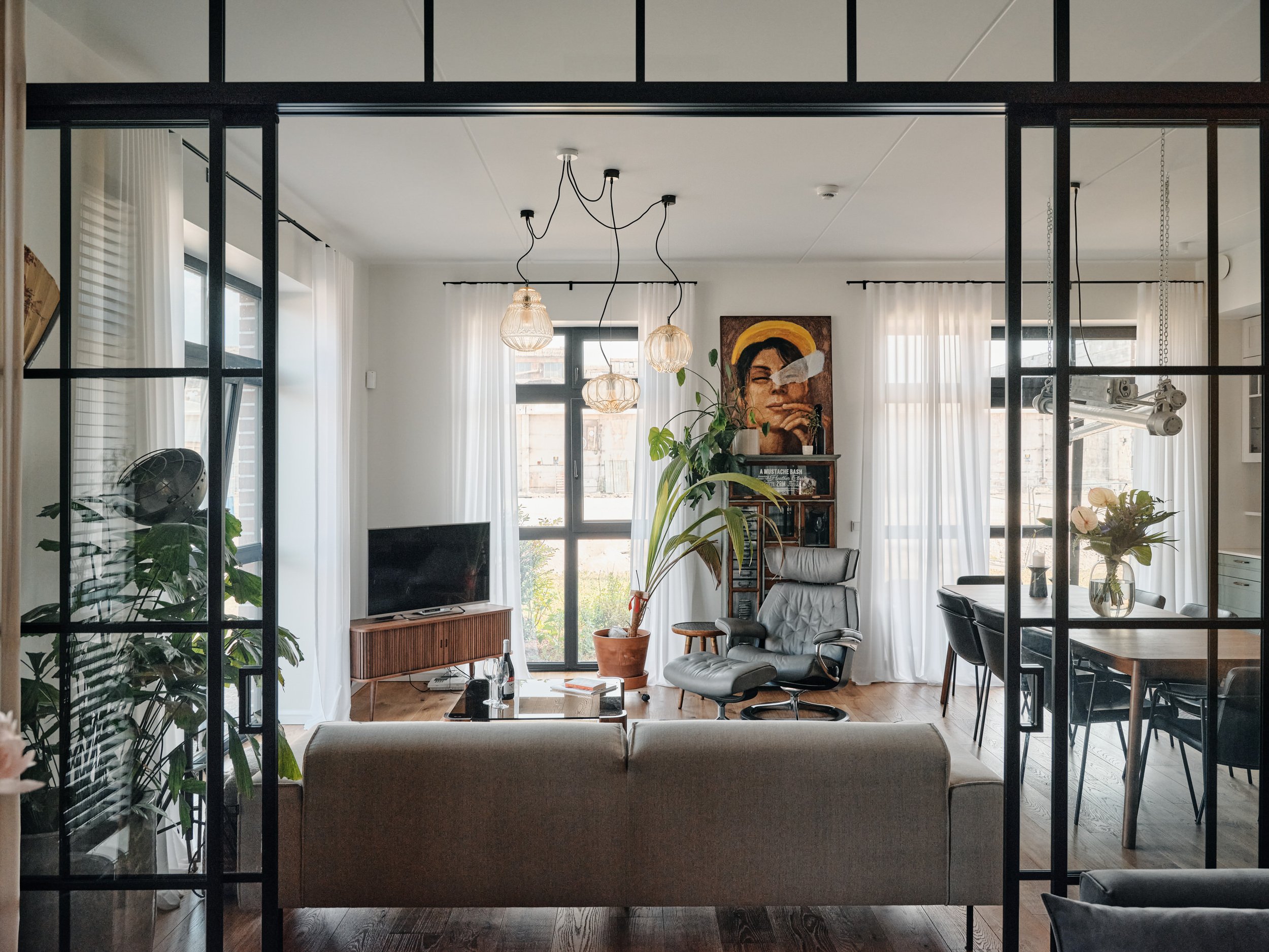
This ground-floor corner apartment in the new Volta development offered great light and fantastic potential, but like most new buildings, its white walls and generic flooring needed some personality.


Photo: Tõnu Tunnel

VINTAGE vibes

This family of three had a few interesting pieces to put in this new space, but needed to tie everything together with new furniture in a cohesive design — bringing warmth, modernity and a touch of vintage. Using tailor-made pieces and expanding the sourcing to online auction houses turned this project into a very collaborative and exciting adventure that resulted in a truly unique and inviting space.

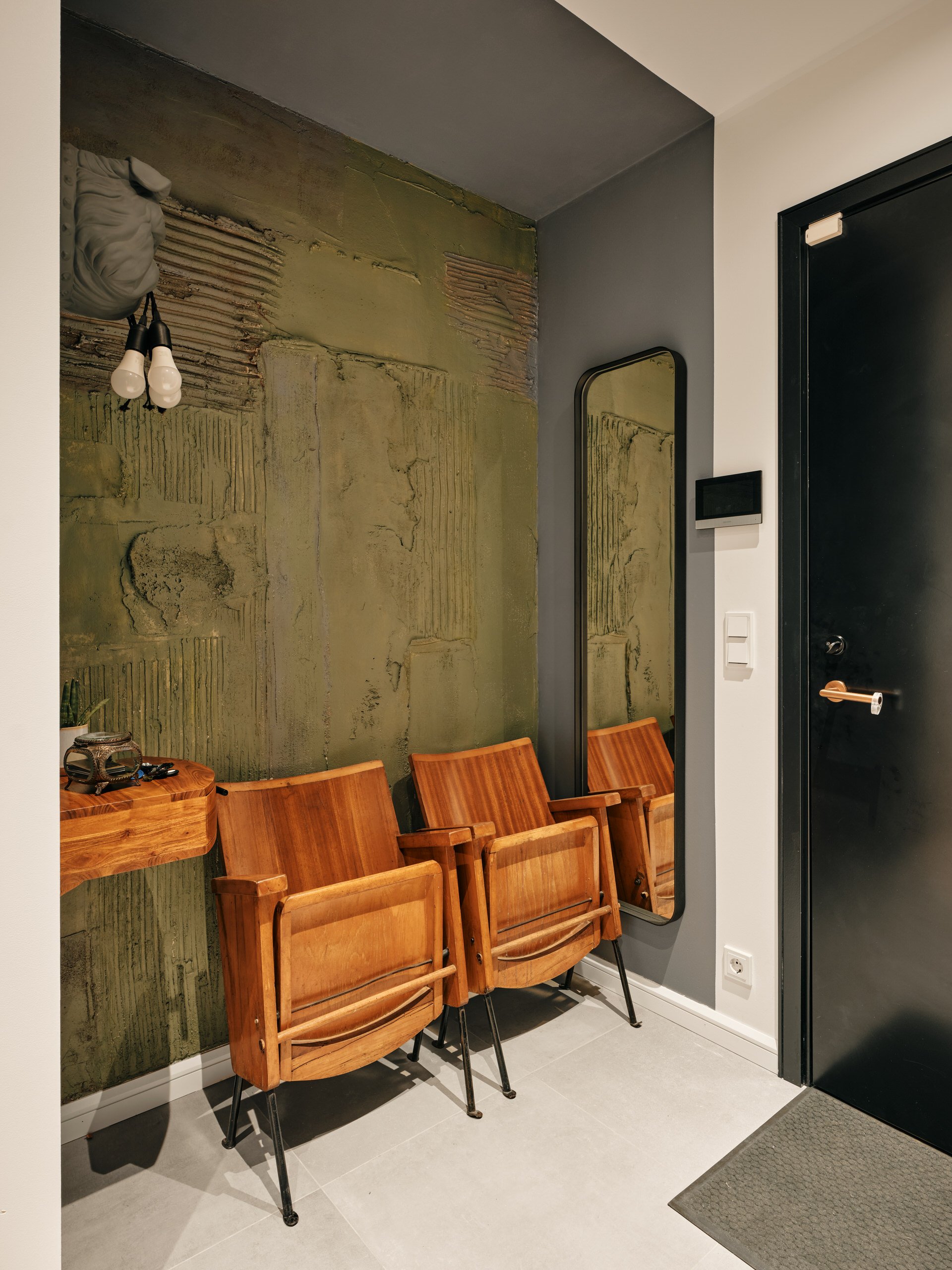
CINEMATIC ENTRYWAY

To ensure comfort when getting ready, the seating option here comes from an old cinema in Italy, in front of a background painted by a couple of artists.

A mirror, “watchdog” lighting and drawer complete the set so that everything fits in place.

CUSTOM GLASS DOORS

As the apartment was bought on plan, we needed to quickly figure out an idea to convert the third bedroom into an office space.

The solution was to replace the main plaster wall with a glass sliding door to give an open and airy feel, which was then finished with a custom-made shelving unit occupying the entire back wall.

VINTAGE LIGHTING

With the dining area and kitchen being all new, some vintage pieces were needed to tie in with the rest of the space. We found some mining lamps from the former USSR on auction, and all wiring and hanging systems were redone to ensure a soft glow and elegant effect.

Warmth and Colour in this Bauhaus-Style Beach House

This Bauhaus-style house in Pärnu’s beach neighbourhood in southwestern Estonia had a lot of space and light but was lacking in personality and warmth. By adding colour and warm oak tones, the space is now welcoming year round, even on short, grey winter days. 


Photography by Eiliki Pukk

EXTENDING THE TERRACE

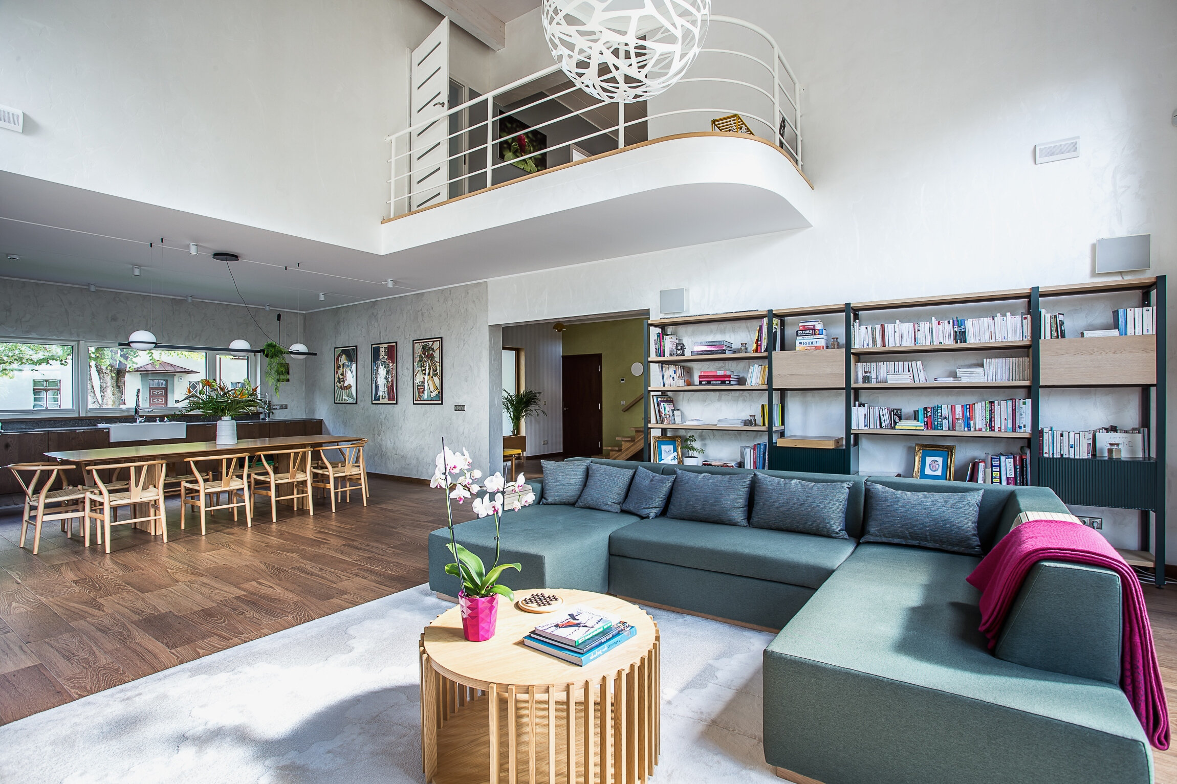
The house is built on a north-south axis with a large bay window overlooking the garden and a lovely apple tree. The rug in the living room is a reflection of that tree, and the green tones were added to create a seamless transition between indoors and outdoors.

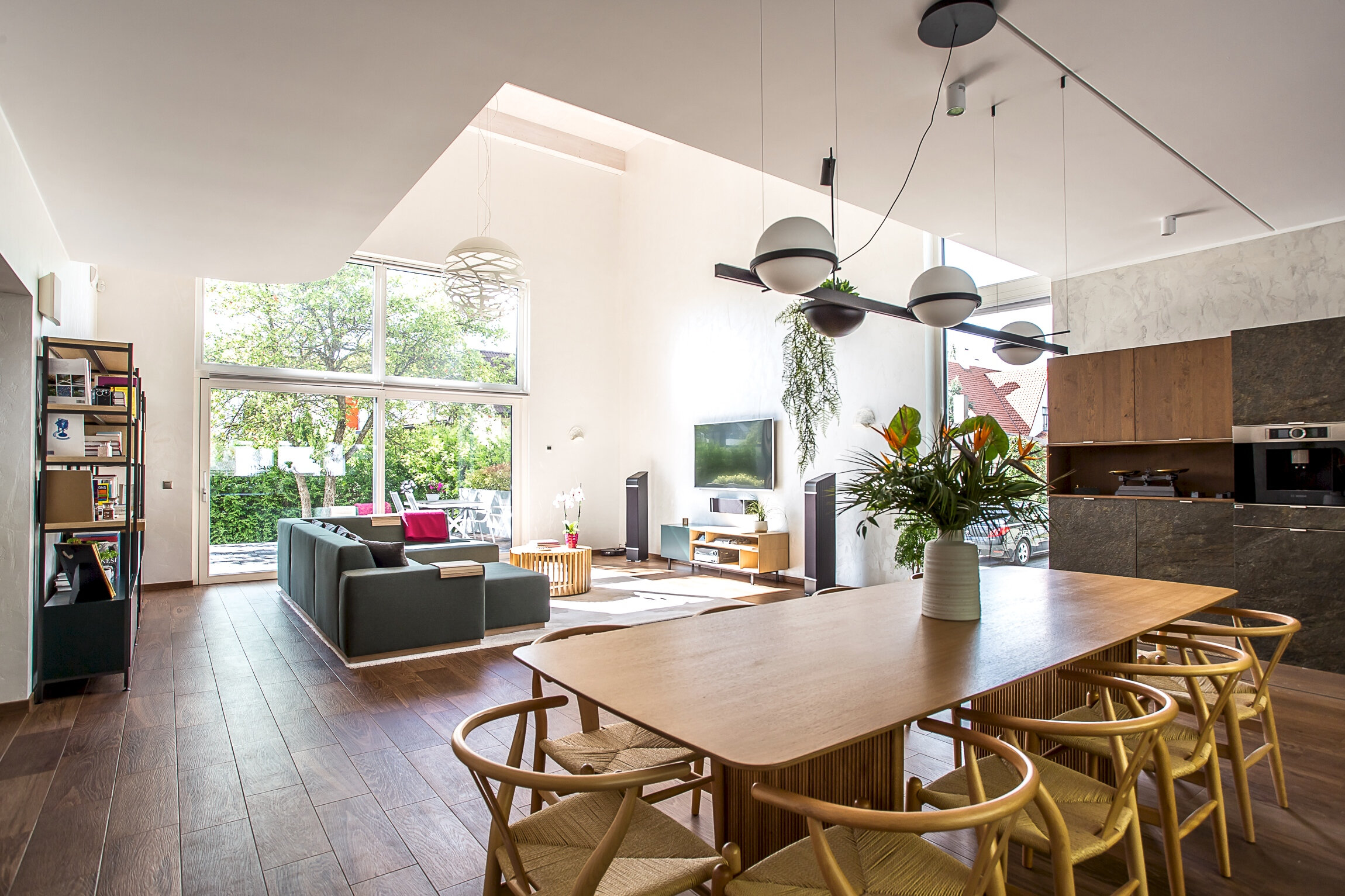
COLOURFUL LIVING

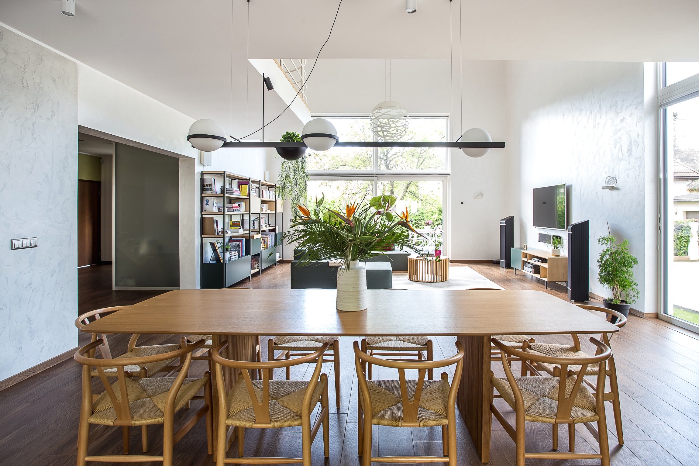
With a 6-metre high ceiling and very white walls, the living/dining room used to feel rather cold, but with touches of green and pink, some welcoming wooden tones and organic shapes, the space is now warmer and cosier.

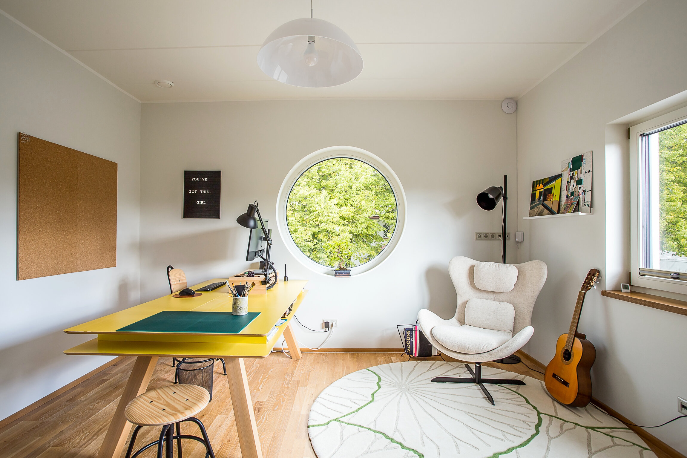
BRIGHT AND INSPIRING OFFICE

The owners both work from home and have one office downstairs and one upstairs — with very different functions. The upstairs one is a vibrant yellow to encourage creativity and playfulness.

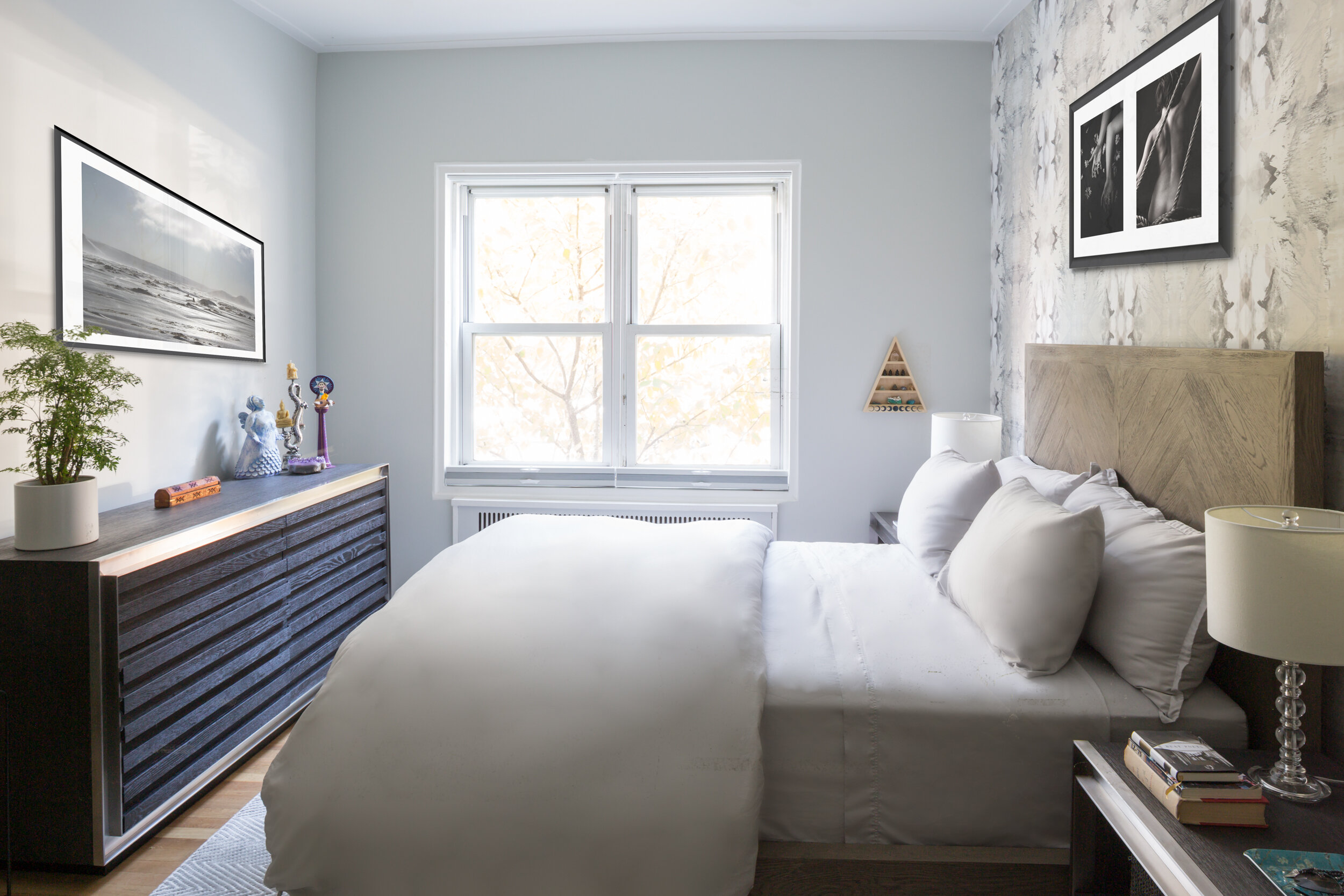
RELAXING HAVEN

The north-facing master bedroom used to be very dark with brown tones throughout. The new design offers white and green colours, a lush, forest-themed wallpaper and luxurious velvet curtains to create a relaxing atmosphere.

A Bright and Colourful Kadriorg Apartment

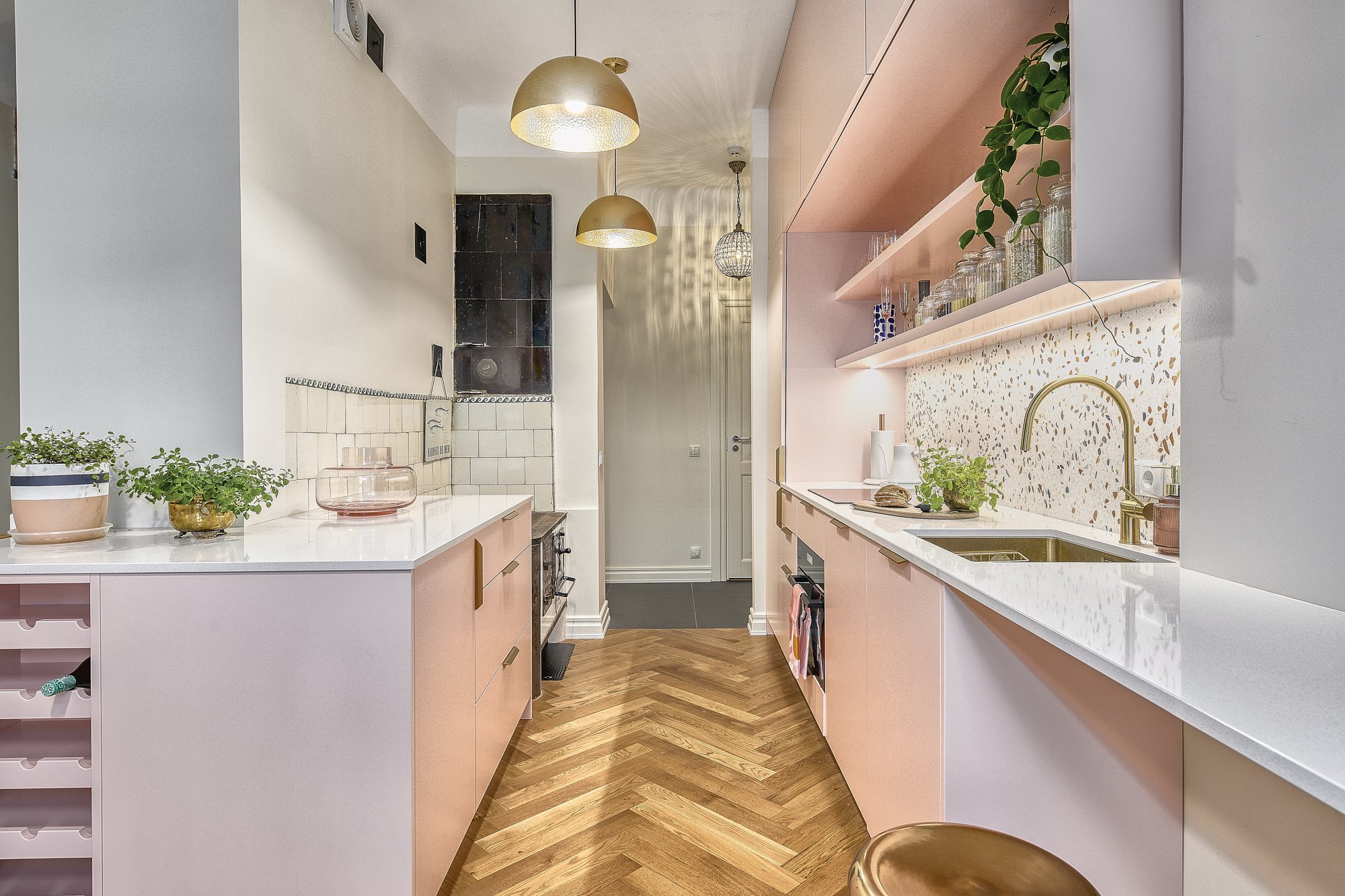
Located in the heart of the Kadriorg neighbourhood in Tallinn, this one-bedroom duplex was crying out for some colour to bring its many quirky features to life. Thankfully, the owner was looking for a colourful approach — starting with a pink kitchen.

 
Photography by Karl Kasepõld

Photography by Karl Kasepõld

PINK, BRASS & TERRAZZO

This landmark building had been entirely renovated prior to the client moving in, but the finish was mostly flat and grey. The client began by saying she wanted a pink kitchen with a colourful terrazzo, and we suggested adding some brass to the mix to bring everything together.

J. Vilmsi 7-4_010-fix3.jpg

MID-CENTURY MODERN LINES

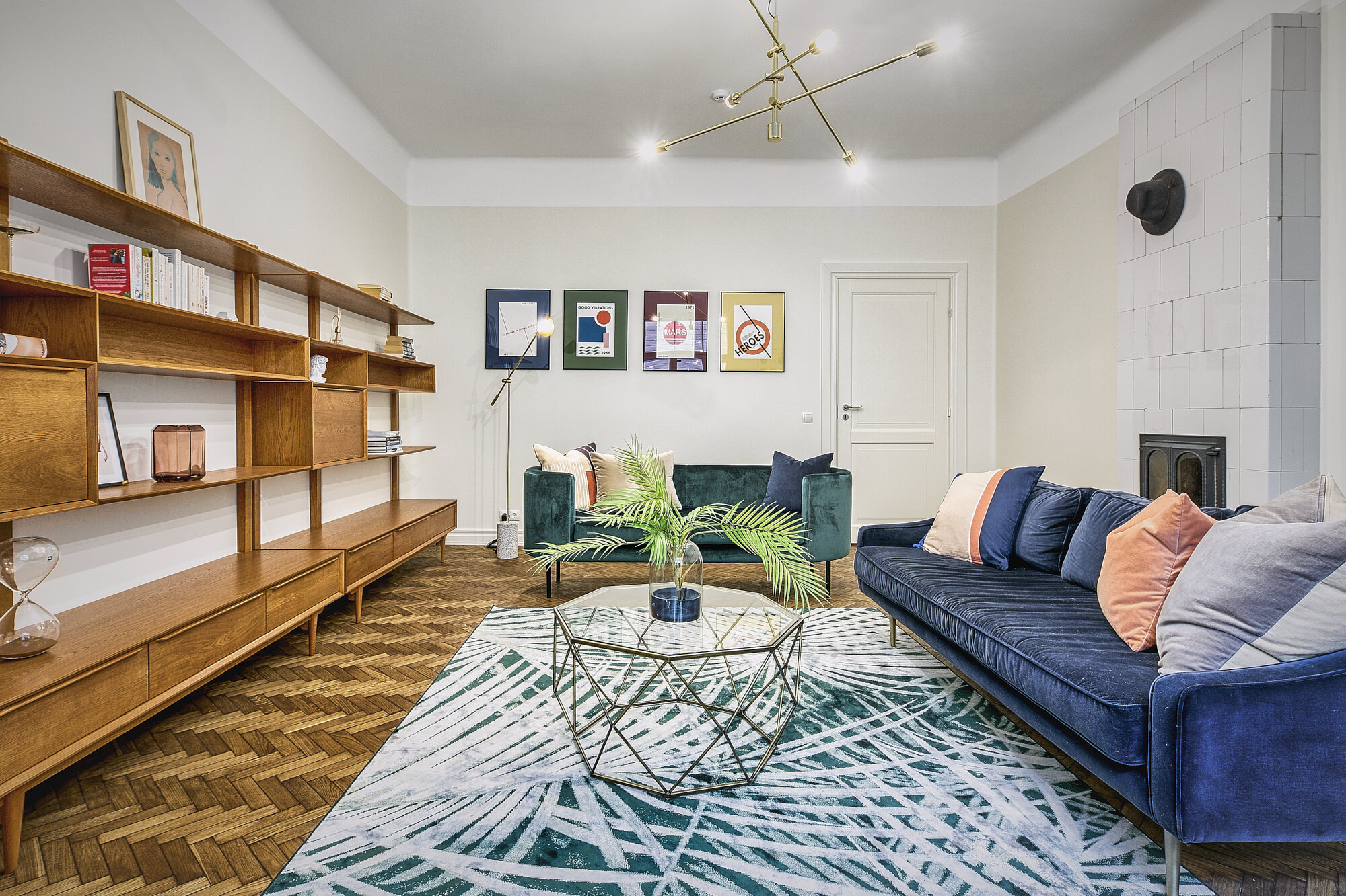
The client already owned a few pieces with a very mid-century modern aesthetic, so we furnished the rest of the space along the same lines, adding some palm patterns and brighter colours to anchor it in 2020.

J. Vilmsi 7-4_021-fix3.jpg

BRIGHT DINING ROOM

The dining room/office faces north-east and does not get much light, so the idea was to bring light in by colouring the walls a bright yellow and balancing that with some blue on the lower half.

J. Vilmsi 7-4_026-fix3.jpg

STYLISH BRICK WALLS

The bedroom on the lower level is the only part where the original grey brick wall is exposed, so we played with it and added tasteful touches of colour for a soothing yet stylish master bedroom.

A Feng Shui Approach with a Touch of Rock ‘n’ Roll

A busy lifestyle with lots of travel for this family of four led them to crave a soothing place to come home to. Blending feng shui and family heirlooms, this renovated space is now a safe haven for each family member.

 
Photography by Brad Stein

Photography by Brad Stein

LIGHTING UP

This apartment is located on the ground floor on a very leafy street near Park Slope in Brooklyn, which sounds like a blessing but made getting light in tricky while maintaining privacy.

_ED_3119-1 copy.jpg

CUSTOMISED PIECES

A pre-war building can be a wonderful place to live in, but it also means the space has a lot of nooks and crannies that need custom-built pieces.

_ED_3069-Edit.jpg

SOOTHING MASTER RETREAT

Tucked away in a corner off the main living room, the master bedroom is now a soothing space for the couple to relax and recharge.

_ED_3125-Edit.jpg

YOUNG TEENS INSPIRATION

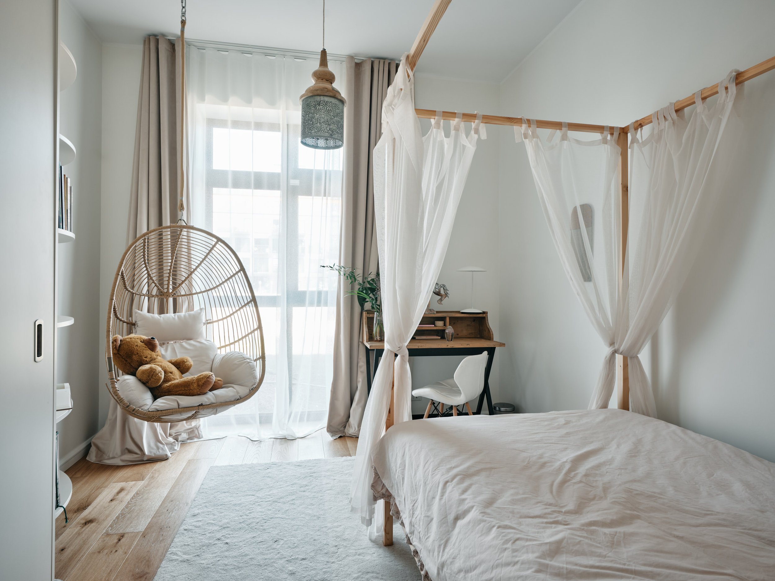
Creating an inspiring and fun design — keeping in mind the girls will grow up quickly in the next few years — was an interesting challenge for this bedroom.

A Graphic Palette to Let the Art Steal the Show

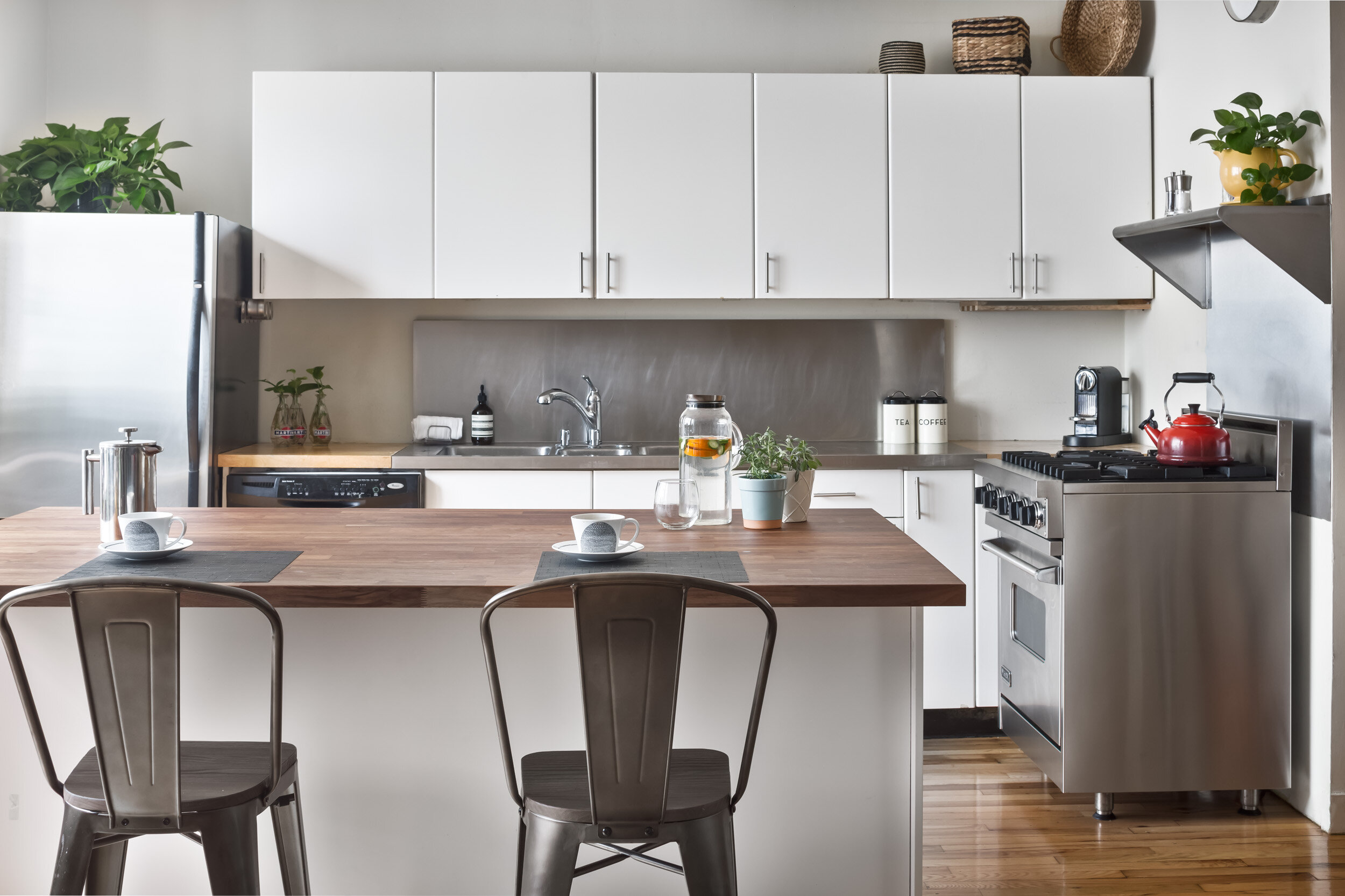
When a young and dynamic family of Brooklynites invested in this gigantic brick loft, a former home of the Federal Brewing Company, they wanted something graphic to let the architecture and their art collection take centre stage.

 
Photography by Brad Stein

Photography by Brad Stein

BRIGHTEN THE SPACE

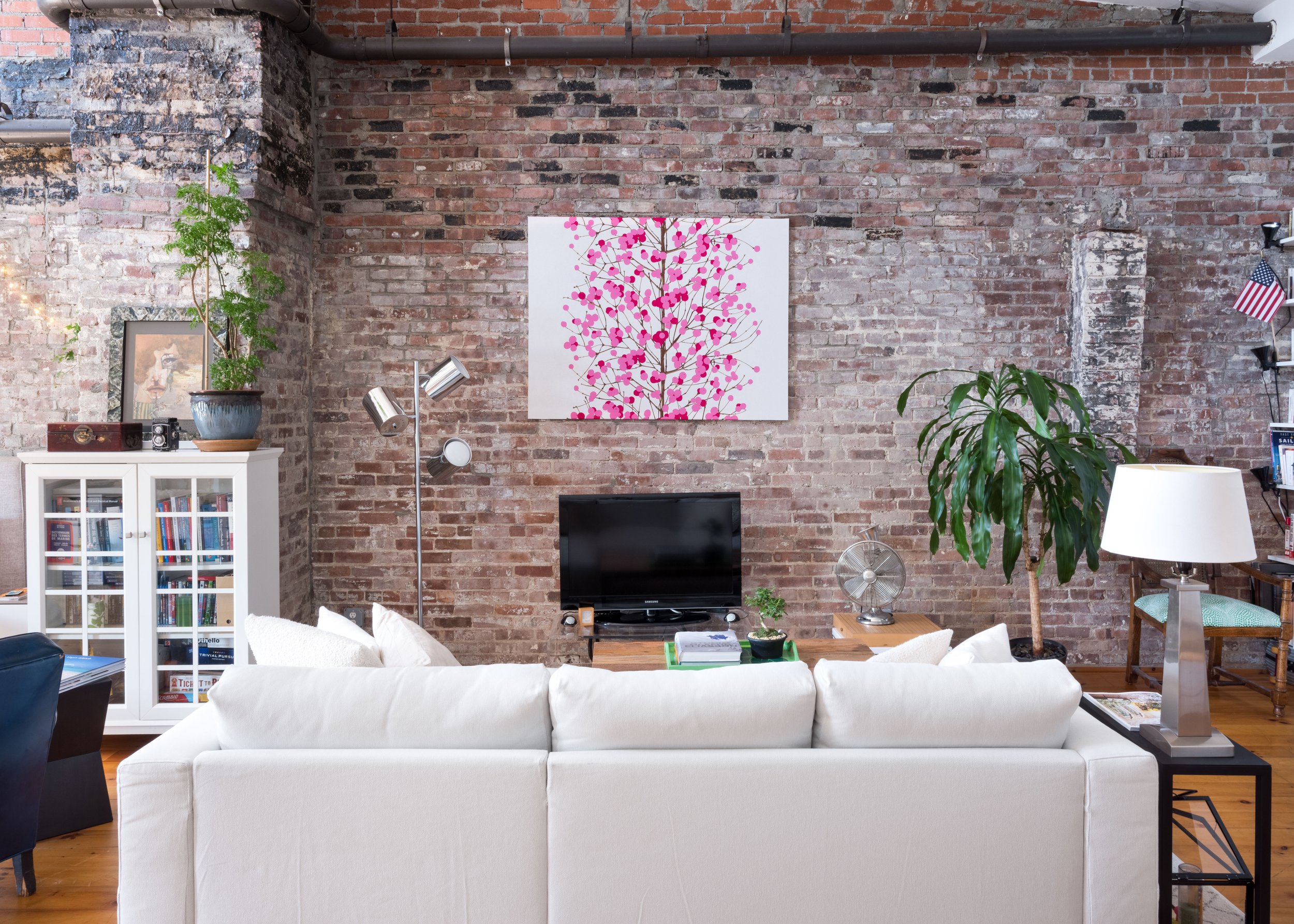
The ground floor of the loft at street level is home to the main living space, kitchen and dining area, with a few bay windows. To counterbalance the lower level, which is darker and more dramatic, this main living room is designed around the colour white to reflect the maximum amount of light.

_ED_0834-1 copy-Edit.jpg

ART, ART, ART

Whether on the wall or as sculptures, the family’s art collection is everywhere and the overall design needed to serve as a backdrop to it.

_ED_0923-Edit.jpg

DRAMATIC DARKS

Another living area downstairs (AKA the den), home to a brick fireplace and a cosier layout, can take a darker and more dramatic palette.

_ED_0967-Edit-Edit.jpg

CUTE NURSERY

Open the door to the nursery and you enter an entirely new world: pretty pink and dreamy wallpapers contrast with the rest of the loft to ensure sweet dreams for the little girl of the house.

Bringing the Outside in to a Tudor House

After an extensive renovation of this Tudor-style house tucked away in a wooded area, this Singaporean family was looking forward to creating a practical, modern and stylish interior that blends with its surroundings.

 
Photography by Lauren Zillinger for Laura Metzler Photography

Photography by Lauren Zillinger for Laura Metzler Photography

A MODERN TOUCH

With a few collectors’ pieces from Asia already in place, this newly renovated house now needed some modern pieces to create a cohesive look throughout its open layout.

191009_Aurelie_0092.jpg

A TOUCH OF DRAMA

The new extension had a dark-blue metal cladding, so the colour palette we picked for the interior was a contrasted and dramatic dark blue and off-white to echo the exterior.

191009_Aurelie_0071.jpg

ADDING GREENERY

Keeping the Tudor style alive with grilled windows can be tricky and reduce incoming light, but thanks to the sheer number of openings in the new building, all sorts of plants can thrive, inviting the outside in.

K&J interior-transformation

MINIMALISTIC LAYOUT

In this house, the dramatic walls and openings set the mood, so most of the interior remains minimalistic and simple to let the architecture do the talking.

Scandinavian and Mediterranean Styles Meet in This Converted Brooklyn Loft

After three years in this trendy studio loft space, a French and German couple refreshed their decor to optimise the space and ensure it reflected their story, their respective country’s styles and the trendy Brooklyn spirit.

 
Photography by Claire Esparros

Photography by Claire Esparros

CLEAN LINES WITH WARM COLOURS

Mixing both cultures, the decor combines the clean, minimalist lines of Scandinavian design with pops of warm, Mediterranean colour and industrial lighting fixtures that highlight the high ceilings of this converted factory space.

ESPARROS-1.jpg

DEFINING SPACE

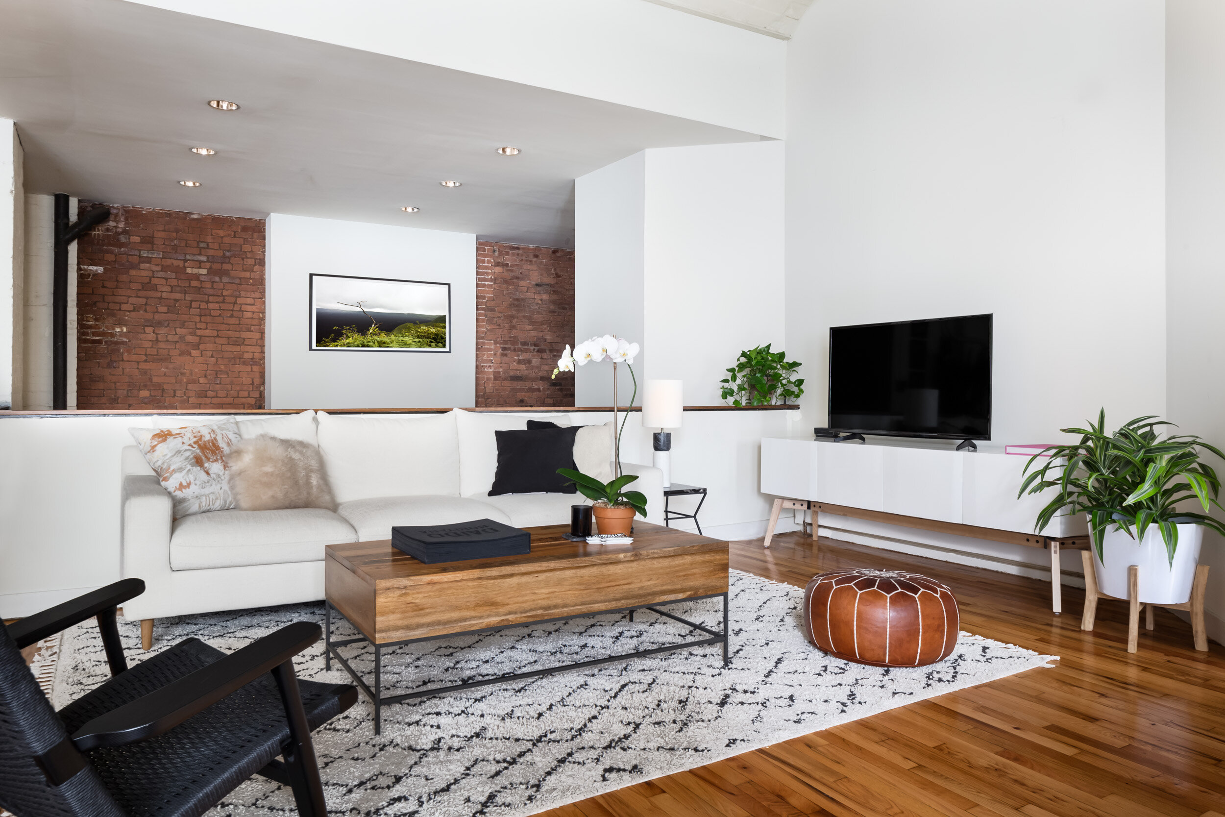
In an open plan, each space and its function need to be defined, which was the first priority when we started this project. We used rugs, low-rise bookshelves and dividers (to maintain maximum light), which created functional areas that felt organic to the raw space.

ESPARROS-9.jpg

CLEAN LINES

Scandinavian minimalism and sleek lines weren’t just an aesthetic choice for this client. They also kept the open space clutter-free and maintained the airy feel of those high ceilings.

ESPARROS-2.jpgA

WARM COLOURS

A high ceiling and stark lines can feel cold. To counter this, we added warm tones of red, orange and yellow — from the kitchen backsplash to the bedroom.

A Soothing Place for Two Inspired Chiropractors

When the two chiropractors from Flower of Life Chiropractic found this space near their residence in Park Slope, Brooklyn, they started thinking about what they could do to make it warm and welcoming for their patients.

 
Photography by Brad Stein

Photography by Brad Stein

CREATING SPACES

The space was initially a large shopfront with an open layout, ideal for a retail store or restaurant but not great for a chiropractic practice, so spaces needed to be created, starting by putting up a wall to divide the waiting area from the adjustment room.

_ED_3153-1 copy.jpg

LETTING THE LIGHT IN

Dividing the space meant the adjustment room was going to be quite dark — a dividing solution was found that offered privacy without cutting out the light.

_ED_3196-1 copy.jpg

PLAY AND NURSING AREA

Flower of Life Chiropractic specialises in treating expectant mothers and young children, so having a separate area for children to play and mums to nurse was paramount.

_ED_3206-Edit.jpg

COSY CONSULTATION ROOM

Ongoing treatments take place in the adjustment room, but the initial consultation has its own separate room with a frosted window where a patient can privately discuss their needs and formulate a plan of action with their practitioner.

Feng Shui for an East Village Studio

Originally from France, the tenant of this studio apartment in the East Village lived in Hong Kong and Singapore before finding his way to New York three years ago. Always on the go, he wanted his interior to reflect his European roots as well as his time in Asia and numerous trips around the world — but remain a soothing, welcoming place he could call home.

 
East Village studio

AN ENVIRONMENT AT ONCE DYNAMIC AND ZEN

This cosy studio apartment in the East Village is in a building that happens to be located on a “pearl sitting” spot, an auspicious configuration from a feng shui perspective. While taking care not to disrupt the advantageous spatial configurations (i.e. “lucky directions”), the tenant made a few adjustments to make the apartment more inviting to guests and to help him feel more grounded.

East Village studio

organiSing spacE

Most feng shui consultations start with this recommendation: clear the clutter and find adequate storage units to house only those belongings considered precious enough to keep. 

East Village studio

ZEN LIVING

The main occupant of the space has lived in Asia for an extended period of time and took up meditation a few years ago. By carefully selecting and arranging certain accessories, we created a space conducive to feeling focused and relaxed.

East Village studio

POWER OF TWO

Usually, a studio is occupied by only one person, whose identity infuses every square inch. But here, the tenant made a point of creating a sanctuary that eschewed a sense of individualism and felt welcoming to all who entered.

Colourful Project for a Bright Brooklyn Apartment

Relocating back to New York after three years in Zurich, Switzerland, this pregnant couple needed to buy most of their furniture to tie in with family heirlooms in their bright, beautiful and modern Brooklyn apartment.

 
K&J interior-transformation

CALDER's INSPIRATION

When we started working with the couple, it became apparent that they liked “wired” and aerial elements, like the artwork on top of the dining table, the texture of the coffee table or the candle holders. It reminded us a lot of the work of the American sculptor Alexander Calder, so the concept was built around that to give the interior an airy and playful feel, in line with Calder’s aesthetic.

20170125-rapoport-052-after-edit.jpg

DEFINING SPACE

The open plan, curved shape and numerous columns in the space made it a little challenging to organise. We created modular spaces that can easily be swapped based on this young family’s needs.

20170125-rapoport-063-after-edit.jpg

MANAGING ODD SHAPES

The floor plan of the space was not a conventional rectangle, so we suggested rounded shapes, a cowhide and other unusual geometric shapes to create a cohesive and playful look. 

K&J interior-transformation

ARTWORK COLLECTION

The couple had collected various pieces during their travels and recently inherited artwork they wanted to display. We suggested various arrangements for a timeless gallery wall.